by Thinus Ferreira
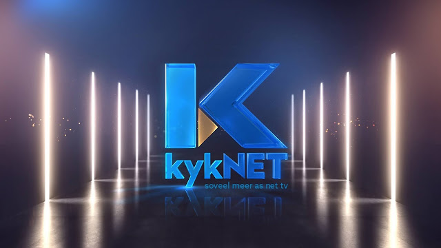
kykNET (DStv 144) has glossed up its on-air imaging and unveiled its latest on-air look, with the channel's rebranding that includes a more transparent, cerulean "K" - together with a drop of gold and a glass finish - and with its stars decked out in glamour wear.
Here's the story behind the work of how kykNET's latest on-air imaging came about.
kykNET switched to the new on-air imaging, done with help from the Clearwater advertising agency, on Thursday morning, with a new slogan of "Soveel meer as net TV" (So much more than just TV) - and including a set of new idents and interstitials, genre endboards, parental guidance advisories and a video promo.
"Over the last 21
years, the kykNET brand name has shown that we are always finding new ways to innovate.
This new look is refreshing and in tune with the world-class Afrikaans
entertainment on the channel," says Karen Meiring, M-Net director for the kykNET
channels.
Leo Smith, kykNET marketing manager, says that "With the
positioning of kykNET as a premium brand name in Afrikaans, it was important to
adjust the graphics to reflect the quality of our content".
"kykNET is one of the biggest brand names in South
Africa and we are very proud of the impact that the channel has had on the
entertainment industry. kykNET is truly so much more than just TV."
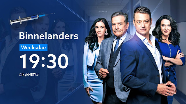
Part of the new campaign and on-air look was a week-long photo session where almost 200 kykNET
personalities were photographed by Willem Botha - each with two outfits that included a formal
outfit, as well as one that reflects the programme that they are known for.
The shoots took place over four days in Johannesburg at Stark Studios where Binnelanders is filmed, and three days
in Cape Town at Atlantic Studios, home of Suidooster,
Arendsvlei, Kwêla and Tussen Ons.
It was an enormous production with one producer and production manager, a production assistant, three make-up and hair stylists, two people responsible for the hundreds of items of clothing that were worn in front of the camera.
These photographs were given to one head designer, two assistant designers, and three animators that in turn created hundreds of images.
Hennie van Deventer from Clearwater, the agency responsible for the new campaign, says that "The new branding
has a strong focus on the people of kykNET - the names and personalities that
viewers welcome into their homes every day".
One
musical director, one lyricist and singer, and a sound engineer provided the
fresh new sound and two editors put everything together under the watchful eyes
of a creative director, a copywriter and a creative head. The theme tune was written by Loki Rothman and James
Bassingthwaighte.
"It was a challenge to write lyrics that can be interpreted in two different ways," says Loki Rothman.
"We aimed to write a song for the channel that can be played on the radio or be played on its own without knowing that it was written for kykNET. I think we achieved the perfect balance."
Covid's impact
kykNET originally started working on the channel's new on-air look about a year ago in 2020 just before the global Covid-19 pandemic hit and cause a worldwide shutdown and caused the project's end date to be pushed to 2021.
"We briefed Clearwater about the project in 2020 but when Covid hit we first had to focus on schedule changes, had to adjust our content plans, and announce and roll out new series," Leo Smith tells TVwithThinus.
"Since we couldn't do photo sessions for months, we had to push out the project completely to 2021, after which we could do it within Covid-safe protocols. Clearwater started working full speed in October 2020 on creative options and by December we made the treatment choices."
"In January we started with planning and now during April we could roll out the latest look," says Leo Smith.
He says kykNET decided on the new on-air imaging since the last imaging was introduced in 2017.
"After 4 years on-air it was time for change. Renewal is always important especially if you want to keep the offering enticing for viewers".
"The new imaging reflects the premium positioning of kykNET," says Leo Smith. "kykNET is a premium Afrikaans brand - and also one of the biggest Afrikaans brands in the country."
"It's important that it signals to viewers that the content that they're looking for will be of extremely high quality. The on-air imaging is your glossy magazine cover. The content is the pages inside. It has to appeal to viewers".
Regarding the sound, Leo Smith says that kykNET was looking for a fresh, new sound that would appeal to a wide audience and the channel thought of an artist that would bridge various audience demos whilst representing the future of Afrikaans music.
"We made contact with Loki Rothman who's done the music for things like the kykNET Film Fiela se Kind. He's a very talented artist and his approach was immediately spot-on. He developed 5 different options of which one turned into our final choice," Leo Smith says.
"This year we decided that we want to use one photographer for the entire series of publicity photos for the channel. Willem Botha's profile has grown so much the past few years - he also photographed Miss Universe and the Miss South Africa contestants - that I just immediately knew that he would capture exactly what we needed."
"He's also a singer and artists and a presenter on kykNET and has the ability to bring out the very best from every subject in front of his lens."
Leo Smith says that the most challenging of the process was "to remain 100% true to the brand's history but also the audience - to give them something fresh and new without alienating them from what they're viewing every day. And then to also know that what we've created now must still look good in 3 or 4 years' time from now".
While kykNET is an Afrikaans channel, market research constantly indicates that a lot and an ever-growing number of people who don't have Afrikaans as their home language, tune to the kykNET channels on DStv to watch the content. What does kykNET attribute this to?
"When kykNET lures viewers from other language groups it's because of a very simple reason: kykNET content transcends language," says Leo Smith.
"The quality of our stories are of such a level that viewers constantly return to kykNET for more - and also, of course, that people want to see South African content. We're producing everything 100% locally."
"It's very important for us to do direct audience engagement with viewers through our involvement and support of the various arts festivals, for instance, community activations in smaller towns, or projects like the Silwerskermfees where we create opportunities for a wider ecosystem of entertainment," he explains.
A glamour-wand of cerulean blues and gold
Marleux Feyt, executive creative director at Clearwater, jokingly tells TVwithThinus that a bit of "obsessive-compulsive disorder" or OCD always helps when it comes to creating beautiful on-air imaging projects for clients like kykNET.
"In some ways, we are a little OCD when it comes to these
things. We've been making mental notes since before we got the ball rolling as
an official project," she says.
"We also know that kykNET is a personality in itself
and retaining that is important - we don't want someone waking up and switching
to channel 144 to find something that feels too different."
"There's a fine line
between fresh and 'what is this?', so we retained the navy and
cerulean blues of the logo, gave the yellow triangle a metallic upgrade and
waved a glamour wand over the lot for a glass and gold finish on the
logo.
About the painstakingly Rumpelstilskin-work that starts from a blank slate, she says that "every part of the process has
something magical about it - even the crippling 'blank page' phase at
the start".
"The best part is always cracking the first design frame. It really
is the branding equivalent of an 'ah-ha' moment. It also fuels the
rest of the process."
"That design frame also keeps us on course because for the
next few weeks, all your test animations are going to look grey and a little
sad until the motion is completed and the colour gets added back
in."
About working with kykNET, Marleux says that "It is an absolute dream to
work with a team that has such deep respect for art in all its forms and the
people who create it".
"Leo is also one of the most creatively literate clients
you'll ever meet. It's not often someone can tell you exactly which reflection
pass they would like to change in an animation. It really does fuel our team
to go above and beyond.
'Distilled storytelling'
About what Clearwater attempts to create, she says their vision "is always to connect people with
content and that often means putting the emotion of a show, movies or
entire channel in a neat package - anything from a 90-second spot to a
5-minute logo animation".
"We need to use every tool available to us to create an
emotional connection - be it a laugh, some goosebumps or just a moment to
breathe - with whatever we produce. I always think of it as distilled
storytelling."
"The kykNET imagery is definitely an example of
that."
"To give it an undeniably premium and luxurious feel, the logo animation - the one with the gold drop - went through 11 iterations."
"Each scene was created
using 40 layers of animation, every reflection, particle glow and light flare
was considered and discussed as a team and to get the detail we wanted, we
digitally rendered the kykNET logo to be 5m tall."
"It seems a little crazy - and we've been called worse," says Marleux Feyt, "but ultimately we're not expecting anyone to notice a reflecting dust particle or a
drumbeat in the music that perfectly coincides with a spotlight switching on - but we hope they feel it".


